Research
Agricultural News and the Humanities

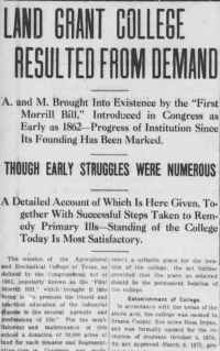
The Bryan Daily Eagle, Bryan, Texas, 20 April 2016.
LOC Chronicling America
For the Historical Agricultural News website, the narrative deals with the myriad facets of agriculture in mid‐ to late‐nineteenth and early twentieth‐century America as seen through the prism of the newspapers of the time. The underlying premise is that farmers and their farms were not isolated entities, but participants in the emerging and collaborative organizations associated with agriculture.
These organizations, like the Farm Bureau and land‐grant colleges, availed farmers of new technologies, co‐operative purchasing power, and other mutual interests for farming success. We can trace the growth and influence of these organizations through the coverage they received in local papers. Because so many people were involved with agriculture in this era, we find frequent news coverage illuminating the lives in small communities as well as the machinations of peripheral industries.
The narrative thus exposes not only economic trends, but also social developments (the aims of the progressive farming movement) and political leanings (the tension between suppliers and co‐op purchasing groups, and the government’s role in this dynamic); it also captures immigration patterns, education trends, and transportation changes.
Site Design
In her argument for a rhetorical approach to user‐centered design, Liza Potts suggests that digital humanities projects often focus on data to the exclusion of user concerns, asserting that “what these archives in practice and the digital humanities in general desperately need is a sense of audience, appeal, and interaction” (255). Thus, a large concern in the design of this site was to create a search engine that makes sense not just for academic researchers, but also for casual users.
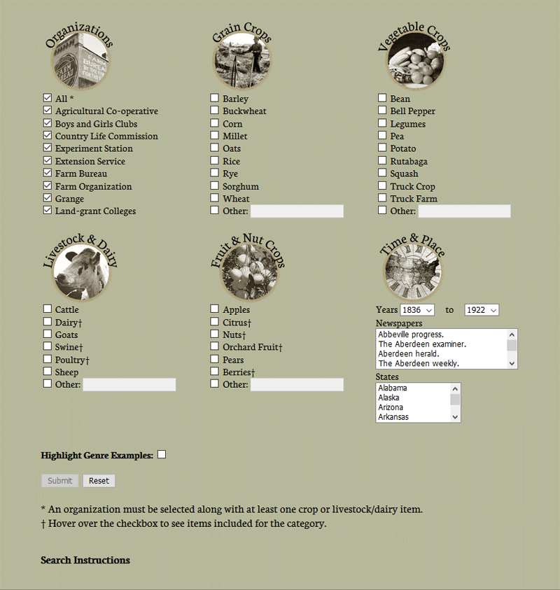
Site designers A. Giroux and Galbreath recognized that visual aesthetics can help establish the narrative for site visitors and guide them through the actions in site navigation. Once A. Giroux designed the user interface, Galbreath located and prepared public domain images, carefully choosing those that impart visual notions of farming in a time of transition. Similarly, the search icons and check boxes were designed to clearly communicate the function of each part of the query tool. A list of suggestions in each search category is included with the goal of triggering connections for visitors as they browse search options. Each icon, combined with descriptive text, illustrates the category it represents.
The categories on the Search screen are grouped in three parallel columns, a display that is easy to view on a full screen. For mobile devices, the categories revert to a single column, which can be viewed by scrolling. In this mobile view, the top navigation bar turns into a Toggle Navigation with a drop‐down page list.

Other considerations were broached as the site developed. The “up” arrow at the right side of the screen remains stationary as the page scrolls, for example, reflecting current navigation ideas for web design that accommodate mobile devices. Chunking text and linking between pages, a long‐standing convention in web design, increases readability while helping site visitors follow connecting ideas. The site colors, serif fonts, and sepia‐coloration of photographs are all design decisions implemented to provide a historical context to the user experience.
An example of humanities research using Historical Agricultural News.